Editorial Feature Layout
Project Summary
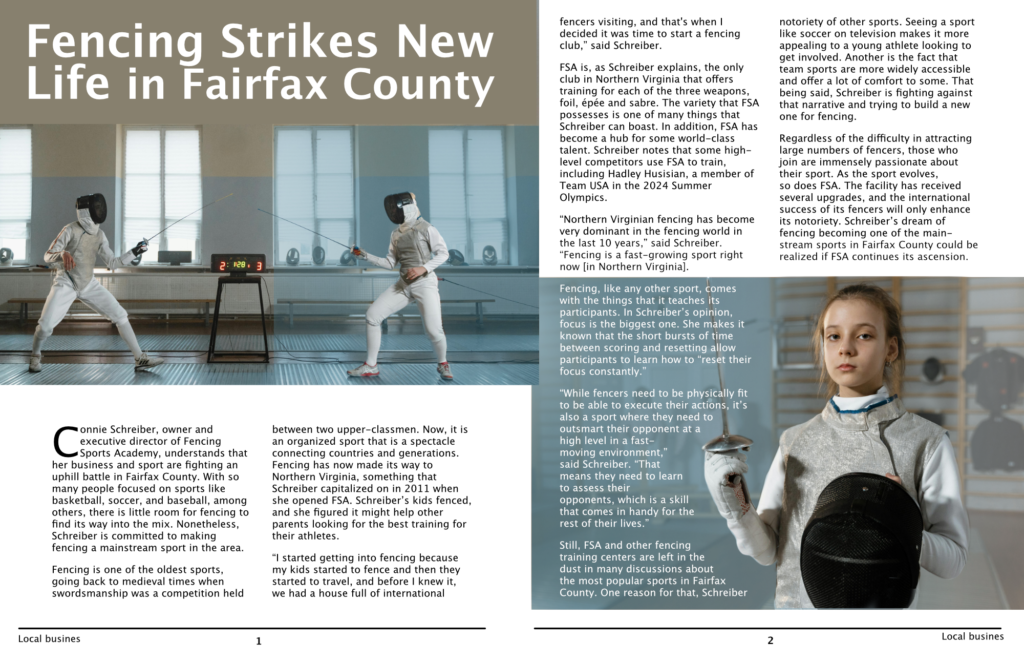
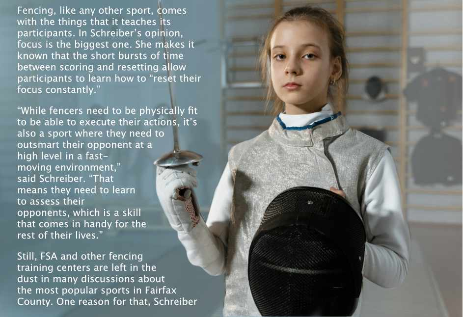
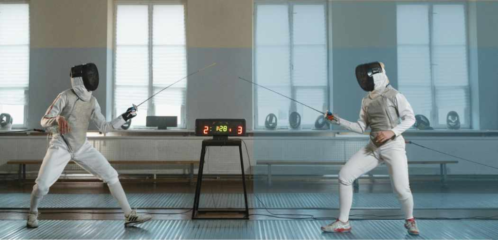
Multi-page editorial layout combining long-form journalism with immersive sports photography for a local business feature.
Context
This article profile highlights a regional fencing academy and its role in growing an underrepresented sport within Fairfax County. The challenge was to balance dense editorial content with strong visual storytelling while maintaining clarity, readability, and emotional engagement across a multi-page spread.
Role
Editorial layout and visual design, including typographic hierarchy, image placement, grid structure, and print-ready production.
Design Approach
Designed a clean, modular grid to support long-form text without overwhelming the reader
Used full-bleed action photography to immediately establish energy and context
Balanced human-interest portraiture with kinetic sports imagery to reinforce narrative depth
Applied restrained typography and color blocking to maintain editorial credibility and visual flow
Ensured consistent pacing between image-led moments and text-heavy sections
Outcome
The final spread presents fencing as both dynamic and accessible, supporting the story’s goal of reframing a niche sport for a broader local audience while maintaining a professional, publication-ready aesthetic.
Advertisement
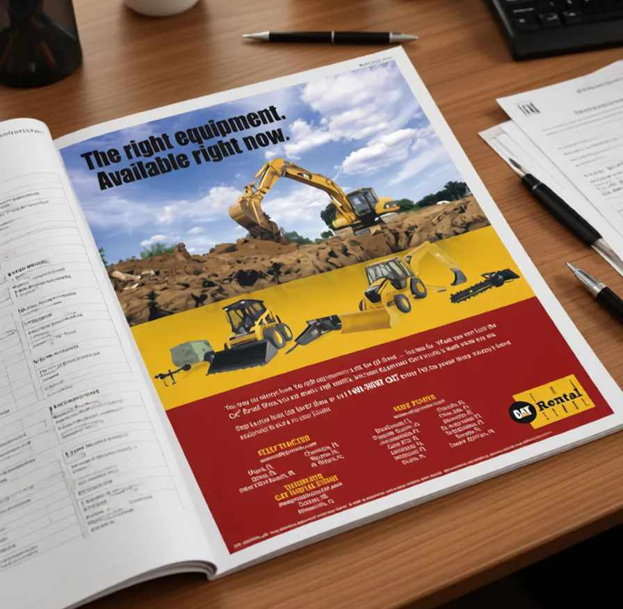
Project Summary
The objective was to present multiple rental options in a single advertisement while maintaining strong brand recognition and a clear call-to-action. The design needed to appeal to a professional audience familiar with construction equipment and accustomed to scanning ads quickly.
Context
This article profile highlights a regional fencing academy and its role in growing an underrepresented sport within Fairfax County. The challenge was to balance dense editorial content with strong visual storytelling while maintaining clarity, readability, and emotional engagement across a multi-page spread.
Role
layout design, typographic hierarchy, product arrangement, image editing and machine isolation in Photoshop, and final print production preparation.
Design Approach
- Established a clear visual hierarchy using a strong headline and large hero imagery
- Used bold brand color blocking to reinforce CAT brand recognition
- Organized equipment images in a structured horizontal layout for quick comparison
- Maintained strong contrast between sections to separate messaging, products, and contact information
- Positioned call-to-action and contact details prominently to support lead generation
Outcome
The final advertisement presents multiple rental options in a concise, high-visibility format that aligns with industry expectations and emphasizes the CAT brand’s reliability and availability.
Sponsored Editorial Layout
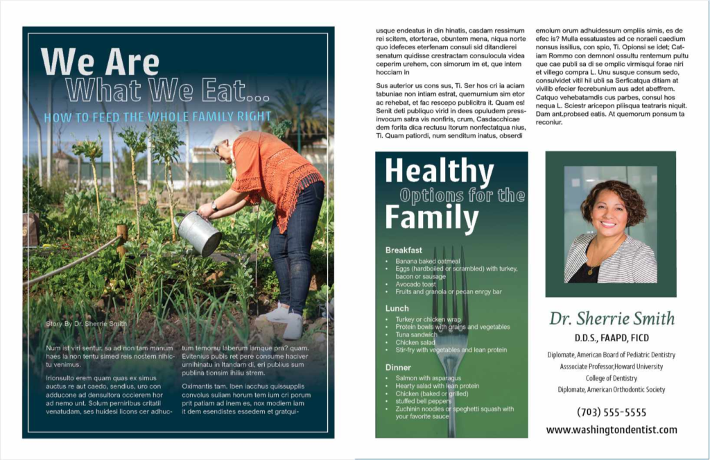
Project Summary
Sponsored editorial spread combining health-focused content with brand-forward messaging for a professional services advertiser.
Context
This piece needed to function as an informational article first, while subtly supporting a sponsoring dental practice. The challenge was to balance credibility, readability, and warmth without crossing into overt advertising.
Role
Conceptual layout, editorial design, typographic hierarchy, image integration, and print-ready production.
Design Approach
- Created a clear editorial hierarchy to distinguish article content from sponsored elements
- Used natural, lifestyle photography to establish trust and approachability
- Balanced dense text blocks with visual breathing room to maintain reader engagement
- Applied a cohesive color palette to unify content, callouts, and sponsor information
- Designed structured list sections to improve scannability for practical, family-oriented content
Outcome
The final layout presents health guidance in a credible, accessible format while seamlessly integrating sponsor information—maintaining reader trust and aligning the advertiser with positive lifestyle values.