Brand Identity Concept
Project Summary
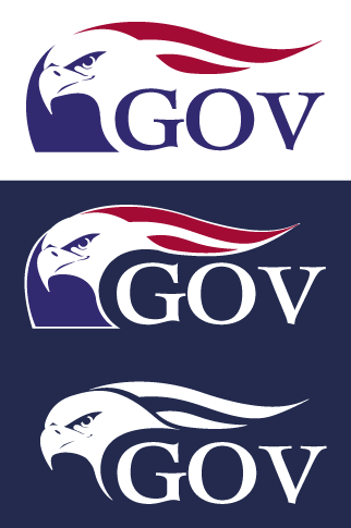
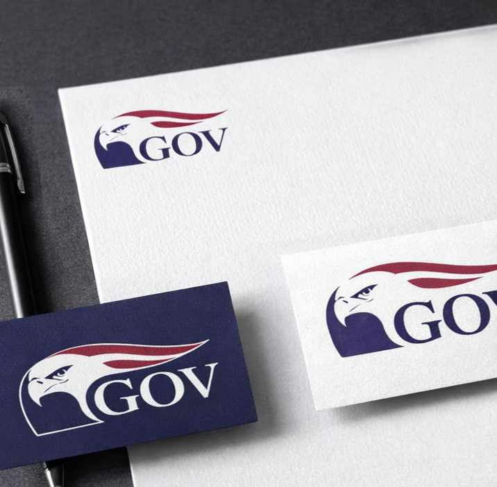
Logo concept developed as part of an internal exploration to modernize the visual identity of the U.S. Government Accountability Office.
Context
Logo concept developed as part of an internal exploration to modernize the visual identity of the U.S. Government Accountability Office while preserving the symbolism of the American eagle.
Role
Designed a series of logo concepts exploring updated representations of the eagle symbol. Developed vector artwork, refined typographic pairings, and produced variations to evaluate legibility and adaptability across light and dark backgrounds.
Design Approach
- Simplified the eagle form into a clean, scalable silhouette suitable for digital and print use
- ntegrated American flag elements within the eagle form to reinforce national identity and institutional authority
- Balanced traditional patriotic colors with a more modern, restrained composition
- Produced alternate background and contrast variations to test flexibility across applications
Outcome
The exploration contributed to internal discussions around visual modernization and demonstrated potential directions for evolving GAO’s visual identity while respecting its institutional heritage.
Event Branding & Logo Design
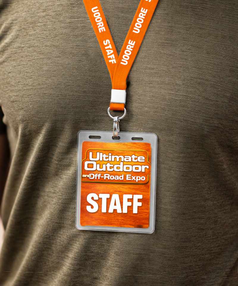
Project Summary
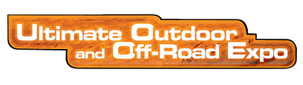
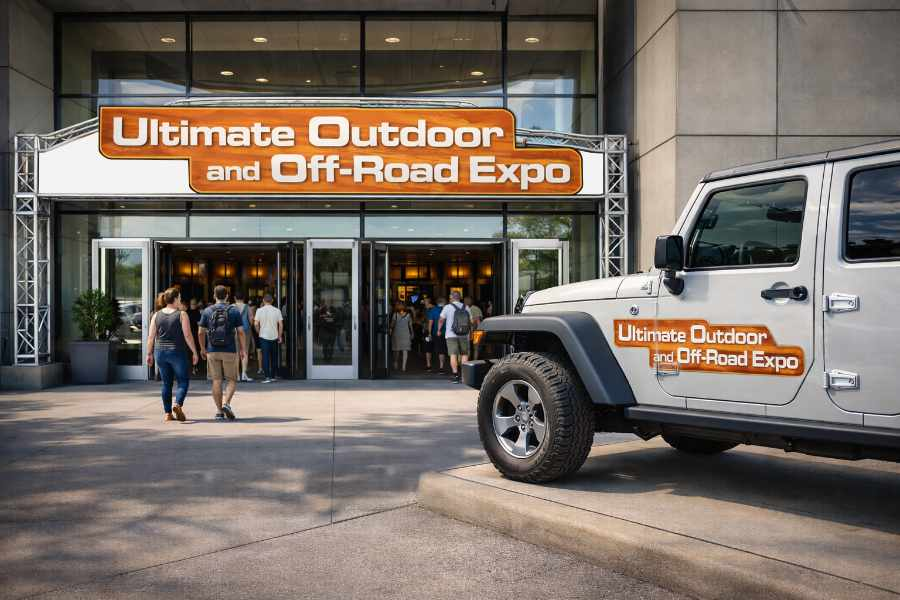
Logo design and visual identity concept created for a trade show focused on outdoor recreation, off-road vehicles, and family camping activities.
Context
The event aimed to attract outdoor enthusiasts, off-road vehicle owners, and families interested in camping and recreational gear. The branding needed to convey rugged outdoor energy while remaining accessible to a broad audience attending a large public expo.
Role
Designed the event logo and visual branding concept, including custom typography, color selection, and stylistic treatments reflecting outdoor recreation and off-road culture.
Design Approach
Developed a bold, high-visibility wordmark suited for signage, banners, and promotional materials
Used warm earth tones and terrain texture to evoke natural outdoor environments
Integrated dimensional typography to suggest strength, durability, and adventure
Structured the layout to keep the event title clear and legible across a wide range of applications, including signage, digital promotion, and print materials
Outcome
The final identity established a strong visual theme for the event, helping communicate its focus on outdoor adventure, off-road recreation, and family-friendly activities.
Personal Logo
Project Summary
Logo and visual identity developed for personal use.
Context
The identity needed to function across a wide range of applications—from digital portfolios and client-facing materials to physical branding and future product lines. It required a balance between creative expression and professional clarity, positioning RB Design as both a design service and an evolving creative brand.
Role
Designed the logo and foundational visual identity, including symbol development, typography pairing, and light/dark system variations for flexible use across platforms.
Design Approach
- Developed a minimal, geometric monogram that abstracts the initials “R” and “B” into a unified form
- Focused on strong silhouette recognition to ensure the mark remains identifiable at small and large scales
- Used rounded forms and solid massing to create a sense of structure, balance, and modernity
- Built a dual color system (light and dark variants) to maintain consistency across different backgrounds and use cases
- Paired the symbol with a clean, neutral wordmark to reinforce clarity and professional tone
Outcome
The final identity provides a flexible, scalable mark that supports a broad range of applications—from portfolio presentation to brand extensions. It establishes a clear visual foundation for RB Design, allowing the brand to evolve while maintaining a consistent and recognizable presence.